
Cropping issues
Why your image isn’t cropping to the size you expect
How Auto-Cropping Works
Section titled “How Auto-Cropping Works”The HTML/CSS to Image API has a powerful auto-cropping feature that automatically sizes your image to match your HTML content. When you send an HTML snippet, the API crops the resulting image to the dimensions of the outermost HTML element.
However, this only works for HTML snippets—not full HTML pages.
The Most Common Mistake
Section titled “The Most Common Mistake”The most frequent cropping issue we see: sending a full HTML page when you meant to send an HTML snippet.
What Happens with a Full HTML Page
Section titled “What Happens with a Full HTML Page”When you include <!DOCTYPE html>, <html>, <head>, or <body> tags, the API treats your content as a full webpage and renders it inside the default viewport (1920x1080 pixels).
Example of what NOT to do:
<!DOCTYPE html><html><head> <style> body { margin: 0; padding: 0; background: #f5f5f5; } </style></head><body> <div style="height: 200px; width: 400px; background: white; border: 2px solid #e74c3c;"> <h2>My Card</h2> <p>This should be 400x200</p> </div></body></html>Result: Instead of a 400x200 image, you get a 1920x1080 image with your content in the corner:
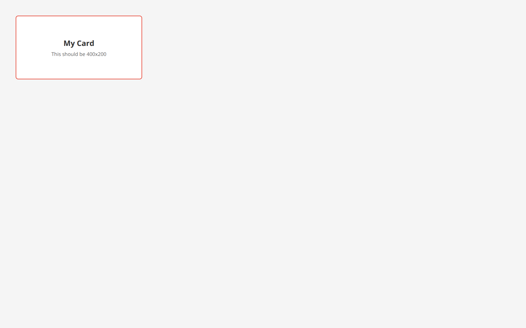
Notice how the image includes the entire viewport with a gray background, not just your 400x200 card.
The Solution: Use HTML Snippets
Section titled “The Solution: Use HTML Snippets”Remove the <!DOCTYPE>, <html>, <head>, and <body> tags. Send only the HTML elements you want in your image.
The correct approach:
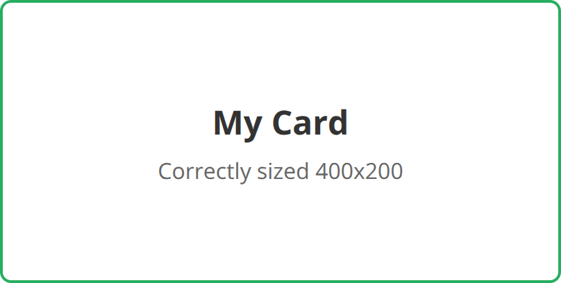
<div style="height: 200px; width: 400px; background: white; border: 2px solid #27ae60; border-radius: 8px; display: flex; align-items: center; justify-content: center; font-family: system-ui, sans-serif;"> <div style="text-align: center;"> <h2 style="margin: 0; color: #333;">My Card</h2> <p style="margin: 8px 0 0 0; color: #666;">Correctly sized 400x200</p> </div></div>Result: The image is cropped to the element’s border box. With default content-box sizing, a 2px border adds 4px to each dimension. Add box-sizing: border-box for exactly 400×200 CSS pixels, or 800×400 output pixels at 2x resolution.
Setting Dimensions on the Outermost Element
Section titled “Setting Dimensions on the Outermost Element”For auto-cropping to work correctly, set explicit width and height on your outermost HTML element:
<div style="width: 600px; height: 400px; background: white;"> <!-- Your content here --></div>The API will crop the image to match these dimensions (doubled for retina displays by default).
Using CSS Classes
Section titled “Using CSS Classes”You can also use a <style> tag within your snippet:
<style> .card { width: 500px; height: 300px; background: linear-gradient(135deg, #667eea, #764ba2); border-radius: 12px; padding: 24px; color: white; font-family: system-ui, sans-serif; }</style><div class="card"> <h1>Welcome</h1> <p>Your styled content here</p></div>Adding Margins Around Your Image
Section titled “Adding Margins Around Your Image”Need some breathing room around your content? Add margin to the outermost element. The auto-cropper respects margins and includes them in the final image.
Without Margin
Section titled “Without Margin”<div style="height: 150px; width: 300px; background: linear-gradient(135deg, #667eea, #764ba2); border-radius: 8px;"> <h2>No Margin</h2> <p>Cropped tightly to edges</p></div>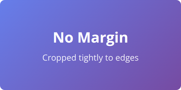
With Margin
Section titled “With Margin”<div style="height: 150px; width: 300px; margin: 20px; background: linear-gradient(135deg, #667eea, #764ba2); border-radius: 8px;"> <h2>With Margin</h2> <p>20px space around</p></div>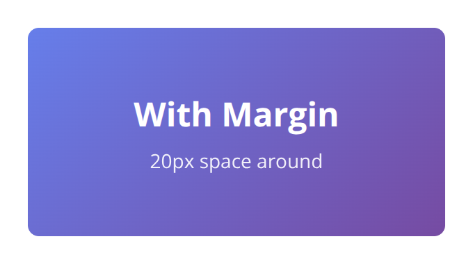
Notice the transparent space around the card when using margin: 20px. This is useful for adding padding around social cards, thumbnails, or any image that needs visual breathing room.
When You Need Full HTML Pages
Section titled “When You Need Full HTML Pages”Sometimes you do need to send a full HTML page—for example, when including external libraries, complex CSS, or JavaScript. In these cases, use the viewport_width and viewport_height parameters to control the image size:
{ "html": "<!DOCTYPE html><html>...</html>", "viewport_width": 400, "viewport_height": 200}Or use the selector parameter to crop to a specific element within the page:
{ "html": "<!DOCTYPE html><html>...<div id='card'>...</div>...</html>", "selector": "#card"}Learn more about the selector parameter.
Quick Troubleshooting Checklist
Section titled “Quick Troubleshooting Checklist”If your image isn’t cropping correctly, work through these steps:
- Remove full page tags — Delete
<!DOCTYPE>,<html>,<head>, and<body>tags - Set explicit dimensions — Add
widthandheightto your outermost element - Check for wrapper elements — Ensure no invisible wrapper is affecting dimensions
- Use viewport params for full pages — If you must use a full page, set
viewport_widthandviewport_height - Try the selector param — Use
selectorto crop to a specific element
Summary
Section titled “Summary”| Scenario | Solution |
|---|---|
| Image is full viewport size (1920x1080) | Remove <html>, <body> tags—use HTML snippet |
| Image size doesn’t match your CSS | Set width and height on outermost element |
| Need space around the image | Add margin to the outermost element |
| Must use full HTML page | Use viewport_width/viewport_height or selector param |
Need help?
Talk to a human. Email support@htmlcsstoimage.com and we’ll help you get started.