Image Block
Use Image blocks for photos, logos, avatars, product images, media library assets, and remote image URLs.
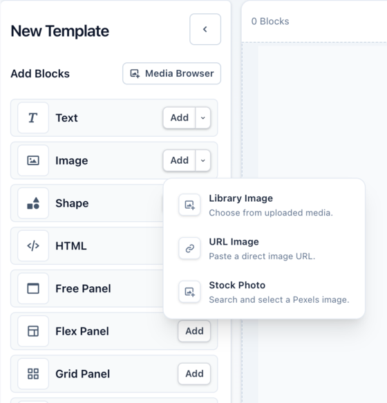
Add an Image block from the left sidebar. You can start from your media library, a URL, or a stock photo, then change the source later from the block controls.
Common Properties
Most blocks share a core set of properties. The right sidebar shows the properties available for the current selection, including controls added by the parent panel.
 Size Control how much space the block takes up
Controls the block's horizontal space. Use a fixed value for a predictable footprint, `%` when the width should respond to the canvas or parent panel, or auto sizing when content or layout should decide the width.
Controls the block's vertical space. Height can be fixed, flexible, or constrained with minimum and maximum values when a block needs room to grow without getting too large or too small.
Keeps width and height connected so a block can scale without stretching. This is useful for images, shapes, and blocks that need to preserve a specific proportion.
Arrange Place and manage the block in its layout
Set the block's position on the canvas or inside a Free Panel. X controls horizontal placement; Y controls vertical placement. Positions can use fixed units or `%` values with anchors.
Move a block to common canvas positions, or use anchors to decide how the block lines up to a percent-based X or Y value.
Rotate the block or flip it horizontally or vertically without changing the block's content.
Lock a block to avoid accidental edits, or move it forward and backward when blocks overlap.
Background Style the surface behind the block’s content
Assign a single color as the background of the block.
- Color
Use a linear, radial, or conic gradient. Gradients are built from stops, and each stop has a color and a position. Stops are ordered by position, so moving a stop changes how the colors blend across the block.
- Stop colors
- Stop positions
Choose a pattern, then customize the colors it exposes. Some patterns also include a size control. Different patterns use different numbers of colors, so the available controls change after you choose a pattern.
- Pattern colors
- Pattern size
Canvas backgrounds
Canvas and block backgrounds are separate. A transparent block can show the canvas background or the parent panel behind it.
Border Define the block’s edge and corners
Border controls are split into simple and advanced modes.
Use simple border controls when the same color, thickness, line style, and corner radius should apply everywhere.
Open Advanced Border to edit sides and corners separately. Sides can have their own color, thickness, and line style. Corners can have their own radius.
Image borders
When an image uses Contain or Scale Down, the visible image may not fill the whole block. Borders and shadows can follow the rendered image more closely than the full block area.
Shadow Layer shadows to add depth to your blocks
Shadows can be layered. Use a regular shadow for depth, an inner shadow for inset effects, or a glow when the shadow should spread evenly around the block.
Block Specific Properties
Media source Media library, external URL, or stock photo
Choose from your organization’s media library, paste an external URL, or select a stock photo from Pexels.
Fit How the image fits inside the block
Fit controls how the image is sized inside the block, including whether it fills, stretches, crops, or stays at its natural size.
Opacity Transparency for the block
Opacity controls transparency for the whole block, including its content and styling. Lower opacity makes the block more transparent.
- Opacity
Object position Which part of the image stays visible when using cover-style cropping Image Sources
The source control decides where the block gets its image.
Media Library
Use the Media Library for assets you expect to reuse, such as logos, product photos, brand images, background images, and icons.
You can upload assets from the media browser when your plan supports uploads. Uploaded assets are shared across your organization’s templates, so the same image can be reused without uploading it again for each template.
URL
Use a URL source when the image already exists at an absolute URL, or when the image should come from render-time data through a template variable.
Stock Photos
Use Stock Photos to choose an image provided by Pexels.
Fit Modes
| Mode | Details |
|---|---|
| Cover | Fills the block and may crop the image |
| Contain | Keeps the whole image visible inside the block |
| Fill | Stretches the image to the block size |
| Scale Down | Keeps the image natural size unless it needs to shrink |
| None | Keeps the image at its natural size |
Templated Content
URL sources can be assigned to a template variable, enabling each image generated to use a different URL.
Many properties can use Variables to assign their value when each image is created.
Variables can be required, ignored, or given a fallback value. When you render the template, pass values with template_values.