Simple Text Block
Use Simple Text when one block should render one text value with a shared style.
Add a Simple Text block from the left sidebar by choosing Simple Text Box. Its content and text properties are available in the right sidebar.
Common Properties
Most blocks share a core set of properties. The right sidebar shows the properties available for the current selection, including controls added by the parent panel.
 Size Control how much space the block takes up
Controls the block's horizontal space. Use a fixed value for a predictable footprint, `%` when the width should respond to the canvas or parent panel, or auto sizing when content or layout should decide the width.
Controls the block's vertical space. Height can be fixed, flexible, or constrained with minimum and maximum values when a block needs room to grow without getting too large or too small.
Keeps width and height connected so a block can scale without stretching. This is useful for images, shapes, and blocks that need to preserve a specific proportion.
Arrange Place and manage the block in its layout
Set the block's position on the canvas or inside a Free Panel. X controls horizontal placement; Y controls vertical placement. Positions can use fixed units or `%` values with anchors.
Move a block to common canvas positions, or use anchors to decide how the block lines up to a percent-based X or Y value.
Rotate the block or flip it horizontally or vertically without changing the block's content.
Lock a block to avoid accidental edits, or move it forward and backward when blocks overlap.
Background Style the surface behind the block’s content
Assign a single color as the background of the block.
- Color
Use a linear, radial, or conic gradient. Gradients are built from stops, and each stop has a color and a position. Stops are ordered by position, so moving a stop changes how the colors blend across the block.
- Stop colors
- Stop positions
Choose a pattern, then customize the colors it exposes. Some patterns also include a size control. Different patterns use different numbers of colors, so the available controls change after you choose a pattern.
- Pattern colors
- Pattern size
Canvas backgrounds
Canvas and block backgrounds are separate. A transparent block can show the canvas background or the parent panel behind it.
Border Define the block’s edge and corners
Border controls are split into simple and advanced modes.
Use simple border controls when the same color, thickness, line style, and corner radius should apply everywhere.
Open Advanced Border to edit sides and corners separately. Sides can have their own color, thickness, and line style. Corners can have their own radius.
Shadow Layer shadows to add depth to your blocks
Shadows can be layered. Use a regular shadow for depth, an inner shadow for inset effects, or a glow when the shadow should spread evenly around the block.
Text block shadows
Simple Text blocks support drop shadows and glows. Inner shadows and spread are not available for text blocks.
Block Specific Properties
Content The text value rendered by the block Auto font size Scales text within a defined font-size range
When enabled, the text can scale to fit the block instead of staying at one fixed size.
Available when auto font size is enabled. This is the smallest size the text can use while fitting the block.
Available when auto font size is enabled. This is the largest size the text can use while fitting the block.
- Auto font size
- Minimum font size
- Maximum font size
Padding Space between the block edge and the text
Padding creates space inside the block’s edge before content is laid out.
Use one value when every side should have the same inset.
Open Advanced Padding to set top, right, bottom, and left independently.
Opacity Transparency for the block
Opacity controls transparency for the whole block, including its content and styling. Lower opacity makes the block more transparent.
- Opacity
Font color The text color Line height Space between lines Letter spacing Space between letters Underline Underline style and color Text outline Stroke around text Auto Font Size
Auto font size lets the text scale to fit the block while staying inside the range you set. When it is enabled, Minimum font size and Maximum font size controls become available.
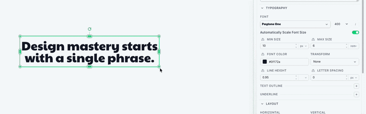
Turn auto font size off when the block should keep one specific font size.
Templated Content
Simple Text can source its Content property directly from a template variable. Do not use Handlebars syntax in the text itself.
Many properties can use Variables to assign their value when each image is created.
Variables can be required, ignored, or given a fallback value. When you render the template, pass values with template_values.